
 About the Site


I started making plans for a Neocities site in the Spring of 2023 when I started taking a web programming class and wanting to create another outlet for my creative projects that wouldn't have the same pressure I do on twitter and tumblr to cater my works to more specific audiences. I'm personally inspired by my days as a young Pokemon fan on the internet and my experiences looking at game guides on the old Marriland website and looking at the fanart hosted on the Aquabunny series of fan sites. I'm also nostalgic for the old days of Deviantart where you could also follow your favorite artist's blog posts along with looking at their gallery. I guess to summarize all that, I feel like social media made me develop an unhealthy relationship with my art that I'd like to fix by building a site where I can keep my own personal art gallery without the pressure of appealing to an algorithm.
Graymin's Glyphs
When I was first getting into Pokemon as a kid, the first Pokemon I was truly obsessed with was Shaymin and in fact it was largely my fascination of this Pokemon in particular that led me to discovering Pokemon Mystery Dungeon: Explorers of Sky, which further solidified my special interest in the franchise. "Graymin" is essentially just a fusion of my IRL name and Shaymin while "Glyphs" specifically refers to my interest in graphic design and typography; a special interest I specifically developed during the time when I was taking a class in Digital Publishing.
 Who's this Hot Pink Thing?
That hot pink waddle doo you see all over the site is Dooloo, my first Kirby OC I made when I first got into the series and the fan community. She's just a weird little guy who I've been enamored with since 2019 and she's kinda become my unofficial mascot. You can learn more about her here.
Any Tips On How To Start My Own Site?
I've linked some programming resources on my Resources page that provides some starting code and and better tutorials for using HTML and CSS than I'm able to currently provide at my skill level. That said, I do have my own recommended starting points that I got from my programming classes that can give you the tools to learn on your own. For example, you should always check W3schools' HTML and CSS guides whenever you see a line of code that you don't recognize, because this website usually defines what that code actually does and is just a great resource in general. Also, I personally use Visual Studio Code to program my site. The program is free and you can download an extension called 'Live Server' that tests your site in a browser as opposed to having to wait for neocities to load your page when you're trying to troubleshoot. From there, you can just upload the files you edit in VSC to neocities whenever you need to update a file. Also a common beginner's mistake I see is not properly utilizing HTML semantic tags when constructing a web page. Semantics are pretty much what they sound like, they're essentially predefinied div sections of code that are usually labled as common/useful tags such as Header, Footer, Section, Article, Figure, etc... Semantics in my experience are essential to keeping a web page organized especially if you're making a web page primarily for the purposes of hosting a bunch of different types of media.
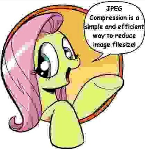
Also always remember to try and reduce the file size of any images you want to add to your site. Gimp is another free program and should be more than capable of exporting images to the JPEG format while still retaining quality, but of course programs like Clip Studio Paint and Adobe Photoshop can do this as well. In summary:

Of course the joke here is to remember to check your export settings is set to the highest quality possible to avoid the same mistake Fluttershy made.
There are some exceptions to this rule though. PNGs are still your best bet for adding images with transparency which will be helpful for logos specifically and GIFs as always are used for small animated images.
Site Button
I did design a button for this website if you want to link Graymin's Glyphs to your own site. If you want to use the non-animated button you will have to change the image source url I provided in the text area. I really appreciate any support!


 Links
Links
| Tumblr: | @shaymin-sylph |
| Bluesky Social: | @shaymin-sylph |
| artfight: | @sylph-of-eons |
| AO3: | @sylph_of_eons |
| Youtube Channel: | Graymin |
| Sheezy.Art: | @Graymin |


